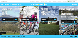
 Context: The layout of this website is clear and straight-forward. It's more colourful than TFF's which I think makes it visually more appealing, and striking. The user gets a lot of information from the homepage alone which is great - they see where the race is going and the length of each race, when it's happening (with dates and a countdown), and have access to their social media sites. The design of the four columns creates aesthetic appeal. In general, they have made the homepage more useful and nicer to look at in comparison to what TFF did with their homepage.
 |
| (click to expand) |
 Content: The site itself offers quite a lot of content - not as much as TFF but still quite a bit. We'll look at the first tab on the menu, '2016'. This page contains text, images and video, so it's pretty detailed. It's a full route announcement, detailing everywhere the route will go, along with pictures of maps and videos making it clearer where the cyclists will be going. Their use of embedded images and videos along with the text is so handy and puts all the information the user will into one part of the website. The image shows the photo of the map and the video showing the route. Underneath the map, there's a link to an interactive map which the user can play around with and get further information about the route. The website's content is information heavy - there's no news tab. TFF is quite a news orientated site. There isn't a great deal of information on their site, unlike Tour de Yorkshire's. Each tab on the menu page has so much information, including road closures, where to stay (accommodation), FAQ's and loads more. I just feel that the information on offer on this website is of much more value to the user as the information on TFF's site would be. Tour de Yorkshire knows that the user will be coming to the website in search of information, so that's what they're getting.
Community: There is no user-to-user communication. Just like TFF's site, there's no form of comment sections, rating systems, or anything that would promote the sense of community on the site. I think it's a shame because it could be an opportunity for Yorkshire to encourage the community to come together for the event, but they haven't taken advantage of this anywhere on the site.
Customisation: I can't find much in terms of customisation other than the feature to change the language of the page. This feature is a toolbar at the top of every page on the site, giving you an option from 8 different languages. This opens up the site to so many more users and facilitates them throughout the site. This is a cool customisation feature, but it's pretty much the only one. TFF's site was also lacking slightly in customisation, but not as much as Tour de Yorkshire. I see Tour de Yorkshire's site as an information hub and not much more, which is nothing bad, but it does have the potential to be more engaging with the website's users.
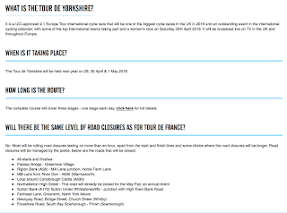

Communication: Just like the TFF's site, the level of communication between the site and the user isn't great. There is an extensive FAQ section with 27 questions in it, but this is about it. As I said, the site is more of an information hub more than anything else. There's also a monthly newsletter they send out which contains news and small bits of information like a link to the FAQ's and clips from last year. The newsletters aren't that frequent, and they don't have much to them that wasn't already on the website, so the level of interactiveness between the user and the site isn't very strong for Tour de Yorkshire.
 Connection: The site has the same idea as TFF by putting the logos of their social media sites at the bottom of the homepage on a bar that stays on a lot of pages as you navigate the site. As I said with TFF's site, pretty much everyone will have an account on at least one of these social media sites so it's relevant for everyone. Even if you don't have an account, the sites still provide access to their updates so it's generally a very good idea to have the links to these sites. On some pages, the site gives the user the option to 'Like', which is an integrated Facebook feature that Tour de Yorkshire has put into their site. There's also a 'Tweet' button, where you can directly share the page with your Twitter followers. Tour de Yorkshire has definitely made more of an effort to involve social media into their site. This could perhaps be an effort to spread the word about the event, seeing as though it's only its second year. Social media is an easy and (sometimes) effective way to market anything, so this is a good start for Tour de Yorkshire.
Aside from this, they also feature useful links to sites other than social media at the top of the homepage which are relevant to the event, so will, therefore, be relevant to users of the site. There's a link to something called a bike library where you can donate and borrow bikes, a link to Yorkshire.com so site users can find out more about the county, a link to official merchandise, and more. These handy links will provide the site user with information, and an actual event-goer with the equipment to attend. The extent the site goes to attain a good connection with other sites is pretty strong - definitely stronger than TFF's site.
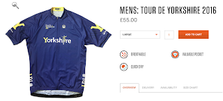 Commerce: The only way the site offers commerce is through merchandise. The link to the site's merch redirects the user to a site with a jersey for sale. The site has other things for sale, but this one jersey seems to be the only thing you can buy in connection to the event. The jersey is £55 and it's something only cyclists would wear, so it's a limited demographic. If profit isn't the goal for the event then they're doing fine, but if it is, then they would have to rely on sponsors really, as spectating is free too. This is the only form of commerce the site offers to the user.
 Connection: The site has the same idea as TFF by putting the logos of their social media sites at the bottom of the homepage on a bar that stays on a lot of pages as you navigate the site. As I said with TFF's site, pretty much everyone will have an account on at least one of these social media sites so it's relevant for everyone. Even if you don't have an account, the sites still provide access to their updates so it's generally a very good idea to have the links to these sites. On some pages, the site gives the user the option to 'Like', which is an integrated Facebook feature that Tour de Yorkshire has put into their site. There's also a 'Tweet' button, where you can directly share the page with your Twitter followers. Tour de Yorkshire has definitely made more of an effort to involve social media into their site. This could perhaps be an effort to spread the word about the event, seeing as though it's only its second year. Social media is an easy and (sometimes) effective way to market anything, so this is a good start for Tour de Yorkshire.
Aside from this, they also feature useful links to sites other than social media at the top of the homepage which are relevant to the event, so will, therefore, be relevant to users of the site. There's a link to something called a bike library where you can donate and borrow bikes, a link to Yorkshire.com so site users can find out more about the county, a link to official merchandise, and more. These handy links will provide the site user with information, and an actual event-goer with the equipment to attend. The extent the site goes to attain a good connection with other sites is pretty strong - definitely stronger than TFF's site.
 Commerce: The only way the site offers commerce is through merchandise. The link to the site's merch redirects the user to a site with a jersey for sale. The site has other things for sale, but this one jersey seems to be the only thing you can buy in connection to the event. The jersey is £55 and it's something only cyclists would wear, so it's a limited demographic. If profit isn't the goal for the event then they're doing fine, but if it is, then they would have to rely on sponsors really, as spectating is free too. This is the only form of commerce the site offers to the user.
Context: 8/10
Content: 8/10
Community: 0/10
Customisation: 4/10
Communication: 3/10
Connection: 10/10
Commerce: 2/10

No comments:
Post a Comment