The websites need to exert the 7 C's:
- Context - layout and design of website
- Content - text, images, videos, sounds
- Community - how the site offers user-to-user communication
- Customisation - the site offers personalised customisation to users
- Communication - level of interactiveness between site and user
- Connection - extent to which the site links to other sites
- Commerce - how the site offers commercial transactions
Context: From first impressions, the site doesn't have much to offer. Everything is very minimalistic, with everything hidden away in scroll-over buttons at the top of the page. There's an advertisement at the top of the page to purchase tickets, but this is the only viable piece of information from a first glance. I personally do not think the website is as striking as it could be. There's an icon for the menu in the top left-hand corner where the user is offered lots of pages to navigate to.

You can find lots of information within these headers about the festival. The news tab offers chronological updates about the event. Within the culture tab, the user is offered more specific news more aimed at an audience who cares solely about the art. The header of the culture page has a scroll over feature which offers an even more specific look into the culture of the festival, which is great for the user to find exactly what they're looking for faster. Within this, you can find sections like videos, photos, interviews, and film. In the film tab, you can find a further specification of news about the cinema shown at the event. I'm finding this information a little repetitive - at first, I thought it was good to have all these sub-headers for information, but now it just feels all the same, and a little overwhelming. This point still stands with the NYC tab. This includes news relevant to New York City, where the event is set. All the articles in this tab were in the previous pages, so I think this tab is unnecessary. Again, the three tabs leading you to videos, photos and interviews can all be found within the culture tab, which should surely question the need for a link to them in the culture tab at all if they're clearly stated as their own tabs in the menu.
 Content: I detailed a lot of the website's content within the context, but to expand on things like videos, the format of the website is good for them. Selecting a video will redirect you to a page where you can watch the video and read an article all about it. The video is a YouTube clip embedded into the website so it's really easy and familiar to use. This is a nice part of the website. You can learn loads from the video and article, and also discover relevant videos you might be interested in. The photos are the same. You can look through lots of slideshows and read the accompanying article to learn more. The format of the site is huge, similar to a cinema, so you can see every detail of the photos and videos. I really like this element of the website. This is about as much as the website offers in terms of media, perhaps pulling you in to want to attend the festival to find even more. In terms of text, there isn't anything specific that shouts out to the user. As mentioned previously, the website itself is rather minimalistic - the text itself can be found within articles, and articles alone really.
Customisation: A cool way the site offers customisation to the user is through something called a "wishlist". The user can browse the films that are going to be shown at the event, and put the ones they want to see onto their wishlist. One would think that if you're able to make an account on the website, you could do more but you can't. This seems to be the only way a user can browse the website and customise it to suit them. I think a comments feature would be really good for the website because people interested in cinema (who will therefore be on the website) will want to discuss films and the event in general, which will also help the website's lacking community features. However, the wish list facility is a great start - the site gives the user a comprehensive list of everything that'll be shown at the festival which they can pick and choose from.

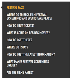
Communication: The level of communication the site offers between them and the user is average. There's a weekly newsletter that is sent via email which is essentially just news updates delivered straight to users so that they don't have to go searching for it. Something I always find handy are FAQ's, and these are featured on the site, but they take some looking for. Even when you go into the 'Contact' tab you can't find them. I found them by searching for 'faq', where they were halfway down the search page below old submission rules. The questions on the left are all they answer, but they cover pretty much everything with detailed answers. There is no direct contact with the users via the website by things like comments, answering questions or anything like that. In the contact tab you can get in touch with the event officials and in regards to publicity and submitting films and ideas, but this is about as far as it goes in terms of site and user interaction.
 Connection: The site links to other sites really well. On the homepage, on articles, on everything, there's always 6 social media icons linking the user to Tribeca Film Festival's social media sites. They're also at the bottom of every page, so the site is constantly trying to get the user to check out their social media sites. The sites are Facebook, Twitter, Tumblr, Instagram, YouTube, and their RSS feed. On the homepage there is a live feed from all of those sites put together so the user can find all of their social media content in one place. This assumes that the event relies heavily on their social media for marketing purposes because they're just simply going where everyone is. Pretty much everyone is on social media now, especially Tribeca's audience, so their heavy presence of social media on their site reflects this.
  |
| Merchandise |
| Banner for purchasing tickets on homepage |
Context: 6/10
Content: 9/10
Community: 1/10
Customisation: 6/10
Communication: 3/10
Communication: 3/10
Connection: 9/10

No comments:
Post a Comment