Friday, 15 April 2016

Tribeca Film Festival - Advertising

I've now analysed both events' websites, so now I'm going to move forward and analyse each event's marketing tools, techniques, and communications.

An obvious place Tribeca Film Festival is going to advertise is in New York City, the home of the event. Advertising is a big deal over there - seven of the world's top eight advertising agencies have their headquarters there. It's a big local event, so local people will attend. New York City has tons of tourists, so they're going to want to go to. If the event is well advertised around the city (which wouldn't look out of place - New York has billboards and advertisements around every corner), then the event will have been well marketed and will gain attendance.

A quick Google Image search of 'Tribeca Film Festival billboards and adverts' showed me a couple of examples of advertising around the city from previous years, seen below:
I won't go into too much detail about these as they aren't from this year's event, but they've made use of both a sponsored marketing campaign with the Diet Coke billboard, and a straight-forward poster on a building which tells you what the event is, the website, and the sponsors. 

When looking for Tribeca Film Festival's advertising for 2016, the best place I could get results was Instagram, through the use of hashtags. The two hashtags I used to search Instagram were #tribeca and #tribecafilmfestival. I searched these in the hopes of finding posts from people who have thought that the advertising was effective or cool enough to post on Instagram. Here were some of my results/screenshots:
These images I've taken from Instagram are all from around New York, showing the impact of Tribeca Film Festival's advertising campaign around the city. They've essentially plastered the event name (along with the sponsor who have naming rights) all over the city to spread the word that the event's coming up. With the trendy logo and quirky locations to advertise on, the marketers knew that they'd make good Instagram posts for residents and tourists. With 75 million daily Instagram users and around 8.5 million people living in New York, the two were bound to collide at some point. 

Tribeca Film Festival doesn't have a very strong presence on Facebook - I couldn't even find the official page when I searched - I had to find it through the website. Through that, I found that they had created an 'event' where Facebook users can say that they're going, or they're interested. 
This page would've been a good opportunity to make up for the lack of communication between both their website and the users, and the users-to-users, but they seemed to have disabled people from posting on the event's wall. Still, they've created an event which is good social media marketing.

Tribeca Film Festival launched quite a few print advertisements this year. Here's a couple:
All photos from the advertisements are of New York, which is pretty appropriate. The photos are iconic scenes and views of a stereotypical New York - perhaps a more glamorous look at the city to attract people to come to the event. The images also promote art itself, which is what the event is all about. I think the event has marketed itself through print advertisement really well because the bright shots of New York not only reflect the city in a positive light, but it also promotes their passion for art. 

There's also a trailer for the event, shown here:
Having a familiar face in the advert (Tracy Morgan) who works in film and TV endorsing the event will attract fans of him and any of the shows and films he's been in. The element of comedy will make people remember the advert, and will ultimately lead the event to success. The advert is sponsored by the network provider AT&T, as is the event (where the company has naming rights), so if people use and/or like this company, they might be convinced to take an interest in the event from the advert and learn more about it. The video on YouTube only has 583 views, so I can't say that many people saw the advert and wanted to see it again, but there's no way of knowing how effective it was in the end, but it's a well-made advert, so Tribeca Film Festival did a good job here.

I think that Tribeca Film Festival's advertising campaigns for this year's event so far have been pretty successful. They've definitely managed to get the word out via social media, and their print and moving image advertisements have been good. I will continue to track Tribeca Film Festival's advertising techniques throughout the event to see how successful they are. 

Thursday, 14 April 2016

Tour de Yorkshire - Website Analysis

I'll now analyse Tour de Yorkshire's website the same way I analysed Tribeca Film Festival's (TFF):

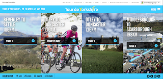
Context: The layout of this website is clear and straight-forward. It's more colourful than TFF's which I think makes it visually more appealing, and striking. The user gets a lot of information from the homepage alone which is great - they see where the race is going and the length of each race, when it's happening (with dates and a countdown), and have access to their social media sites. The design of the four columns creates aesthetic appeal. In general, they have made the homepage more useful and nicer to look at in comparison to what TFF did with their homepage.
(click to expand)
When you go to the menu button in the top right-hand corner, the user is faced with a lot of options to navigate the site. There doesn't seem to be much of an order to the options i.e. alphabetically listed, category listed etc. so it could be a bit overwhelming to find specific information, considering the site doesn't feature a search bar. However, the information is all in one place here, instead of TFF's countless menus. Tour de Yorkshire's menu layout is much better in terms of having all information in one place.


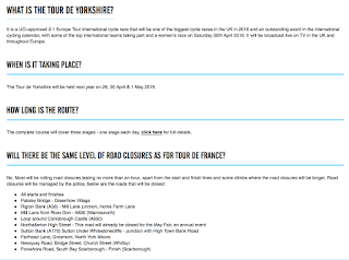
Content: The site itself offers quite a lot of content - not as much as TFF but still quite a bit. We'll look at the first tab on the menu, '2016'. This page contains text, images and video, so it's pretty detailed. It's a full route announcement, detailing everywhere the route will go, along with pictures of maps and videos making it clearer where the cyclists will be going. Their use of embedded images and videos along with the text is so handy and puts all the information the user will into one part of the website. The image shows the photo of the map and the video showing the route. Underneath the map, there's a link to an interactive map which the user can play around with and get further information about the route. The website's content is information heavy - there's no news tab. TFF is quite a news orientated site. There isn't a great deal of information on their site, unlike Tour de Yorkshire's. Each tab on the menu page has so much information, including road closures, where to stay (accommodation), FAQ's and loads more. I just feel that the information on offer on this website is of much more value to the user as the information on TFF's site would be. Tour de Yorkshire knows that the user will be coming to the website in search of information, so that's what they're getting.


Community: There is no user-to-user communication. Just like TFF's site, there's no form of comment sections, rating systems, or anything that would promote the sense of community on the site. I think it's a shame because it could be an opportunity for Yorkshire to encourage the community to come together for the event, but they haven't taken advantage of this anywhere on the site. 

Customisation: I can't find much in terms of customisation other than the feature to change the language of the page. This feature is a toolbar at the top of every page on the site, giving you an option from 8 different languages. This opens up the site to so many more users and facilitates them throughout the site. This is a cool customisation feature, but it's pretty much the only one. TFF's site was also lacking slightly in customisation, but not as much as Tour de Yorkshire. I see Tour de Yorkshire's site as an information hub and not much more, which is nothing bad, but it does have the potential to be more engaging with the website's users.


Communication: Just like the TFF's site, the level of communication between the site and the user isn't great. There is an extensive FAQ section with 27 questions in it, but this is about it. As I said, the site is more of an information hub more than anything else. There's also a monthly newsletter they send out which contains news and small bits of information like a link to the FAQ's and clips from last year. The newsletters aren't that frequent, and they don't have much to them that wasn't already on the website, so the level of interactiveness between the user and the site isn't very strong for Tour de Yorkshire.

Connection: The site has the same idea as TFF by putting the logos of their social media sites at the bottom of the homepage on a bar that stays on a lot of pages as you navigate the site. As I said with TFF's site, pretty much everyone will have an account on at least one of these social media sites so it's relevant for everyone. Even if you don't have an account, the sites still provide access to their updates so it's generally a very good idea to have the links to these sites. On some pages, the site gives the user the option to 'Like', which is an integrated Facebook feature that Tour de Yorkshire has put into their site. There's also a 'Tweet' button, where you can directly share the page with your Twitter followers. Tour de Yorkshire has definitely made more of an effort to involve social media into their site. This could perhaps be an effort to spread the word about the event, seeing as though it's only its second year. Social media is an easy and (sometimes) effective way to market anything, so this is a good start for Tour de Yorkshire.

Aside from this, they also feature useful links to sites other than social media at the top of the homepage which are relevant to the event, so will, therefore, be relevant to users of the site. There's a link to something called a bike library where you can donate and borrow bikes, a link to Yorkshire.com so site users can find out more about the county, a link to official merchandise, and more. These handy links will provide the site user with information, and an actual event-goer with the equipment to attend. The extent the site goes to attain a good connection with other sites is pretty strong - definitely stronger than TFF's site.


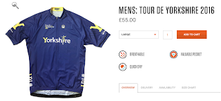
Commerce: The only way the site offers commerce is through merchandise. The link to the site's merch redirects the user to a site with a jersey for sale. The site has other things for sale, but this one jersey seems to be the only thing you can buy in connection to the event. The jersey is £55 and it's something only cyclists would wear, so it's a limited demographic. If profit isn't the goal for the event then they're doing fine, but if it is, then they would have to rely on sponsors really, as spectating is free too. This is the only form of commerce the site offers to the user. 
Context: 8/10
Content: 8/10
Community: 0/10
Customisation: 4/10
Communication: 3/10
Connection: 10/10
Commerce: 2/10

Sunday, 3 April 2016

Tribeca Film Festival - Website Analysis

Direct marketing is utilised by businesses and event organisers to deliver messages and promote their event directly. An example of this is websites. I'm going to analyse the websites of each event to determine how the event markets themselves. 

The websites need to exert the 7 C's:

  • Context - layout and design of website
  • Content - text, images, videos, sounds
  • Community - how the site offers user-to-user communication
  • Customisation - the site offers personalised customisation to users
  • Communication - level of interactiveness between site and user
  • Connection - extent to which the site links to other sites
  • Commerce - how the site offers commercial transactions

Context: From first impressions, the site doesn't have much to offer. Everything is very minimalistic, with everything hidden away in scroll-over buttons at the top of the page. There's an advertisement at the top of the page to purchase tickets, but this is the only viable piece of information from a first glance. I personally do not think the website is as striking as it could be. There's an icon for the menu in the top left-hand corner where the user is offered lots of pages to navigate to.


You can find lots of information within these headers about the festival. The news tab offers chronological updates about the event. Within the culture tab, the user is offered more specific news more aimed at an audience who cares solely about the art. The header of the culture page has a scroll over feature which offers an even more specific look into the culture of the festival, which is great for the user to find exactly what they're looking for faster. Within this, you can find sections like videos, photos, interviews, and film. In the film tab, you can find a further specification of news about the cinema shown at the event. I'm finding this information a little repetitive - at first, I thought it was good to have all these sub-headers for information, but now it just feels all the same, and a little overwhelming. This point still stands with the NYC tab. This includes news relevant to New York City, where the event is set. All the articles in this tab were in the previous pages, so I think this tab is unnecessary. Again, the three tabs leading you to videos, photos and interviews can all be found within the culture tab, which should surely question the need for a link to them in the culture tab at all if they're clearly stated as their own tabs in the menu.
Content: I detailed a lot of the website's content within the context, but to expand on things like videos, the format of the website is good for them. Selecting a video will redirect you to a page where you can watch the video and read an article all about it. The video is a YouTube clip embedded into the website so it's really easy and familiar to use. This is a nice part of the website. You can learn loads from the video and article, and also discover relevant videos you might be interested in. The photos are the same. You can look through lots of slideshows and read the accompanying article to learn more. The format of the site is huge, similar to a cinema, so you can see every detail of the photos and videos. I really like this element of the website. This is about as much as the website offers in terms of media, perhaps pulling you in to want to attend the festival to find even more. In terms of text, there isn't anything specific that shouts out to the user. As mentioned previously, the website itself is rather minimalistic - the text itself can be found within articles, and articles alone really.
Community: The website offers no user-to-user communication. I signed up for an account on their website to see if I could comment on articles or anything but there's just no way to communicate with other users, therefore creating no community. The fact that you can make an account would make the user think there's more to discover on the website, but not really. I had the option to be sent the newsletter regarding the festival via email, but ultimately there is no way to communicate with other users.


Customisation: A cool way the site offers customisation to the user is through something called a "wishlist". The user can browse the films that are going to be shown at the event, and put the ones they want to see onto their wishlist. One would think that if you're able to make an account on the website, you could do more but you can't. This seems to be the only way a user can browse the website and customise it to suit them. I think a comments feature would be really good for the website because people interested in cinema (who will therefore be on the website) will want to discuss films and the event in general, which will also help the website's lacking community features. However, the wish list facility is a great start - the site gives the user a comprehensive list of everything that'll be shown at the festival which they can pick and choose from.


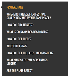
Communication: The level of communication the site offers between them and the user is average. There's a weekly newsletter that is sent via email which is essentially just news updates delivered straight to users so that they don't have to go searching for it. Something I always find handy are FAQ's, and these are featured on the site, but they take some looking for. Even when you go into the 'Contact' tab you can't find them. I found them by searching for 'faq', where they were halfway down the search page below old submission rules. The questions on the left are all they answer, but they cover pretty much everything with detailed answers. There is no direct contact with the users via the website by things like comments, answering questions or anything like that. In the contact tab you can get in touch with the event officials and in regards to publicity and submitting films and ideas, but this is about as far as it goes in terms of site and user interaction.


Connection: The site links to other sites really well. On the homepage, on articles, on everything, there's always 6 social media icons linking the user to Tribeca Film Festival's social media sites. They're also at the bottom of every page, so the site is constantly trying to get the user to check out their social media sites. The sites are Facebook, Twitter, Tumblr, Instagram, YouTube, and their RSS feed. On the homepage there is a live feed from all of those sites put together so the user can find all of their social media content in one place. This assumes that the event relies heavily on their social media for marketing purposes because they're just simply going where everyone is. Pretty much everyone is on social media now, especially Tribeca's audience, so their heavy presence of social media on their site reflects this. 

Merchandise


Banner for purchasing tickets on homepage
Commerce: The first obvious form of commerce the site offers is tickets. When you hit the homepage the first thing you see is a banner stating that tickets are on sale now, and the banner will redirect you to a place to purchase them. This is what they need the sell the most of - the whole event obviously depends on people actually turning up. The straight-to-the-point banner there is a quick way for people to get on the site, get their tickets, and be gone. Another way they attain commerce is through their merchandise which they sell via the site. They sell t-shirts, hats, bags, notebooks, postcards, and mugs. This is general stuff that all people can make good use of, so this is just another way that Tribeca can secure commerce and revenue aside from tickets, and at $35/£24 this is a clever way of doing it.


Context: 6/10
Content: 9/10
Community: 1/10
Customisation: 6/10
Communication: 3/10
Connection: 9/10


Sunday, 28 February 2016

Tour de Yorkshire


The second event I'm going to look at is Tour de Yorkshire. Here's some information about this event:
  • The event is a 3 day road cycling race.
  • It's going to be held between 29 April - 1 May. 
  • The 2014 Tour de France started in Yorkshire, which inspired this event to be held.
  • A woman's race is scheduled to be held on 30 April.
  • Overall the cyclists will cover over 320 miles.
As this year is only its second year, there's limited information on the event itself. There will be more information to report as the event moves closer. This is the official website for the event - I will be analysing how this website is used as a marketing tool for the event as it draws closer, as well as how the event markets itself. 


Tribeca Film Festival

The first event I am going to be focusing on in the Tribeca Film Festival. Here's some information about the event:
  • This year's festival is taking place between April 13-24. 
  • Founded in 2002 by Jane Rosenthal, Robert De Niro, and Craig Hatkoff.
  • Its mission is to "enable the international film community and the general public to experience the power of film by redefining the festival experience". It celebrates NYC as a major filmmaking area.
  • As well as premiering films, they hand out awards, such as 'Best Narrative Feature', 'Best Actress in a Narrative Film', and 'Best Cinematography'. 
  • It has screened over 1400 films from over 80 countries since 2002.
  • Has attracted 4 million people, with the festival generating $750 million for NYC's economy.
  • United Airlines is the festival's official airline. Their flights offer exclusive Tribeca content to in-flight entertainment. 
The festival's official website can be found here. I will be carrying out extensive analysis into this website, as well as research into how the festival markets itself as the event looms.